Game Development – Logo Design of Yora Adventures
![]()
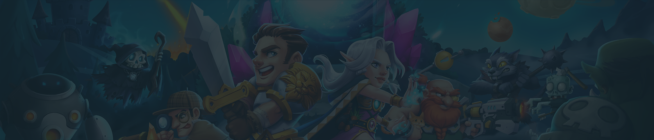
From development to your smartphone
Hey guys! Welcome to our game development blog. From now on we will try to share as many insights, pictures, and videos as possible. You will get some insights in the design process of Yora Adventures. We hope that we can take you on an exciting journey. We are going to start with the first sketches of the logo design process and end with finished image on your smartphone.
So, at the beginning of our series on the creation of Yora Adventures we want to tell you why the logo looks like what it looks like. Find out why a portal plays an important role to us.
“The beginning of the design process always has an idea. Without an initial idea, there can be no development.”
Starting the first prototypes and concept of Yora it quickly became apparent, we need a logo that basically reflects all that what Yora Adventures stands for: New adventure and the opportunity to immerse yourself in another world with your friends.
Based on this goal the most important element in the logo design is going to be a portal. Hardly anything would better portray the journey to another world than a portal itself.
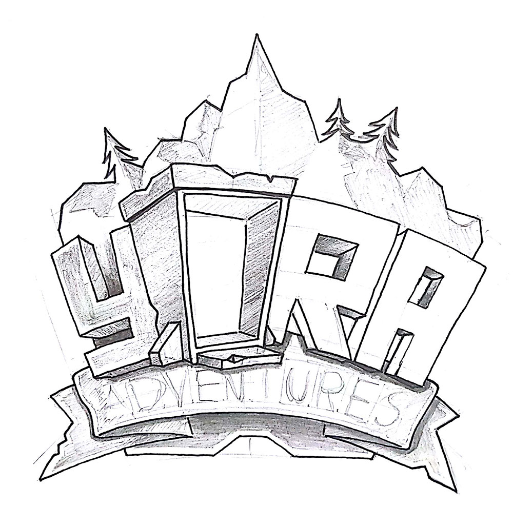
So that the portal, as the main element, also stands in the foreground, we decided to design the lettering in such a way that it is present, but restrained. The letter “O” becomes the said portal. In the beginning of the logo design process especially this area has been reworked several times. The portal catches the eye of the viewer, now.
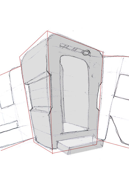
Stage 2: Elaborate sketches
After the phase of collecting ideas and making sketches, it was time to develop the logo further and take the logo design process to the next stage. It was no longer just a two-dimensional lettering. We started to give the whole logo a 3D look so that it would jump even more towards the viewer. We wanted to give the logo a typical gaming look. In the end we had a finished logo for the prototype and the associated first phase of Yora Adventures.
Stepping up the logo design
It was clear to us that we wanted to take Yora to a higher level, after we had finished the first phase. That’s why we decided to develop a new logo based on the first one. Our goal was to incorporate the concept of the role-playing game even more into the design. As a result, we included elements like the D20 dice and various creatures you could immediately recognize that Yora is a game, based on the classic role-playing games of the past.
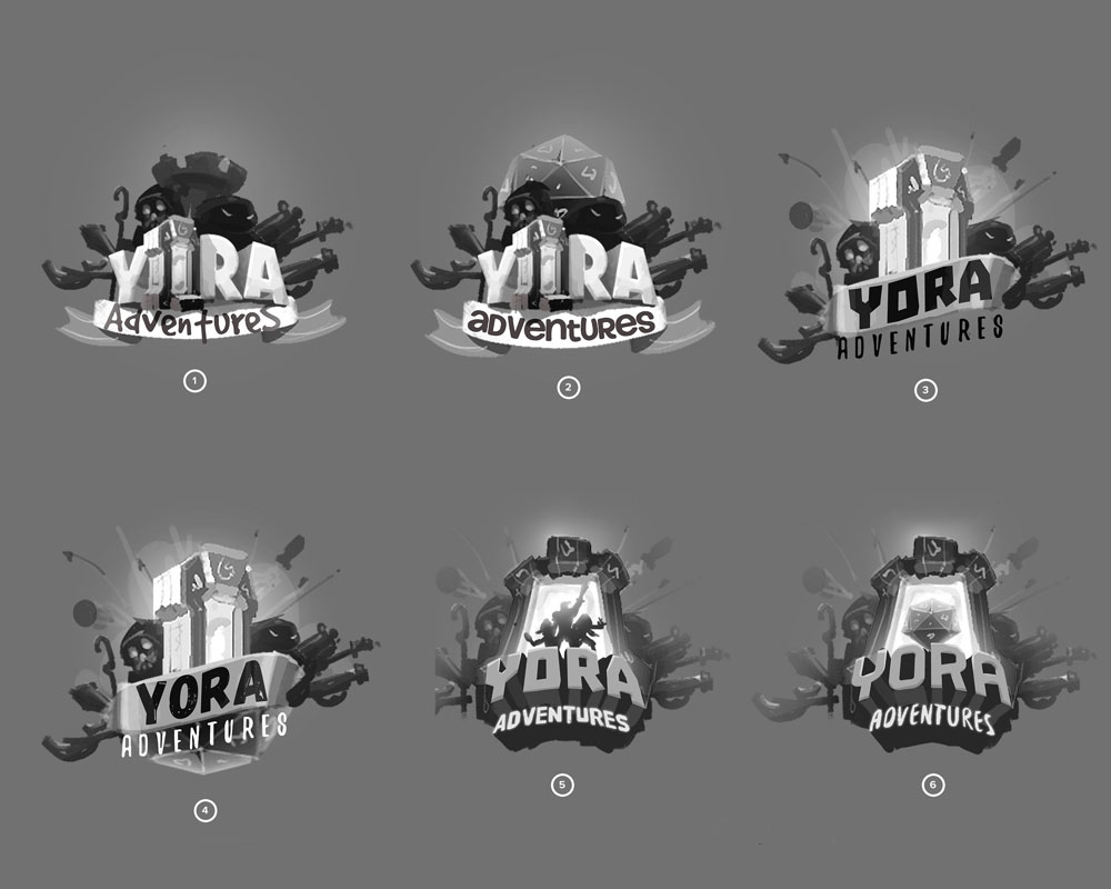
The new logo embodies the idea behind Yora more strongly because the new portal stands even more in the foreground for itself. We left our first, more serious look behind and we made room for a more humorous look. The first thing you can see is the new portal and the characters coming up from it as well as the new monsters, for instance. The characters and monsters also show that Yora Adventures offers more than just one genre of adventures. Furthermore, it is a generic product for various genres.
To match the Yora logo even better with the key visual, we were developing at the same time, we also completely reworked the colors. Everything should look stronger and more colorful for the viewer. In the end we developed a completely new logo for you. A logo which you will certainly see more often within Yora Adventures.
If you like our new logo, visit us on Facebook, Twitter or Instagram and tell your friends about it.