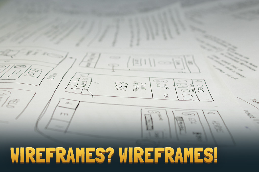
![Wireframes – At the beginning was a pen & a paper [Part 2]](https://yora-adventures.com/wp-content/uploads/2019/05/page_header.png)
Wireframes – At the beginning was a pen & a paper [Part 2]
In the first part of the wireframes series we explained why we need wireframes at all and why they are so important at the beginning of a design process.
In the second part we’re briefly going to explain why we’re not done developing wireframes yet. But first let’s start with looking on the various types of wireframes and their differences.
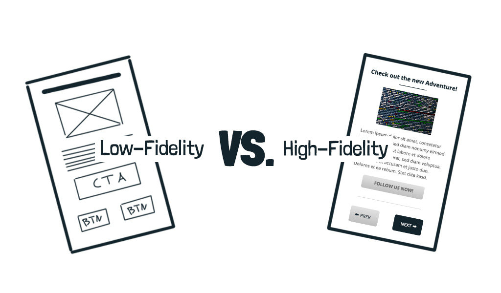
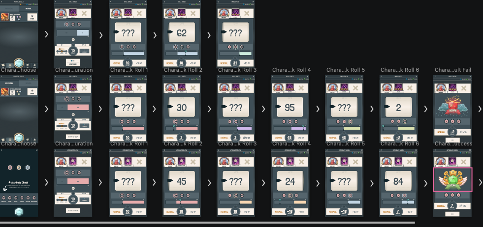
In the first part we described a one kind of wireframes, the low fidelity wireframes. But there ist one other type that is widespread, the so called high-fidelity wireframes. Unlike the low-fidelity wireframes we developed earlier, these are much more advanced.
Advantages of high-fidelity wireframes:
- They look like a finished application
- There is more information for the further process
- They contain real content
- They are the perfect transition to prototypes
The high-fidelity wireframes are much more complex than their less elaborate predecessors. They contain more visual elements like properly arranged, designed buttons and defined fonts. The result: A perfect basis for later prototypes.
To take the next step in the development of Yora Adventures, it is important for us to leave the analog development and dive into digital production at this point. One of the main reasons is the fact that we want to create a look and a feel of the game and the world of Yora asap. Yora is going to be an app at the beginning, therefore it is important to prototype on mobile screens creating a realistic use case. Furthermore, you are able to spread your vision of the app at a very early stage of development on social media and to deliver quality content for your future customers.
Choosing the right tool
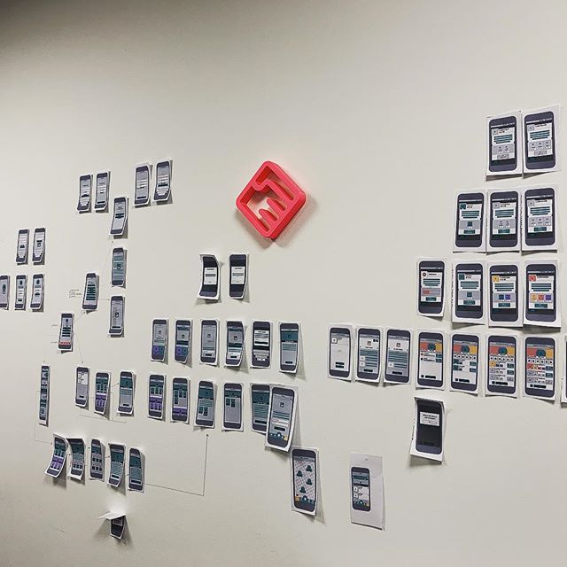
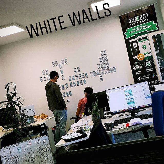
Our main tool we use for UI and UX realisation is Sketch. Sketch is an excellent tool for developing UI and UX elements but only to a certain extent. We divided the development into three main areas: The main menu, the gamemaster area and the player section. At the end of the digital implementation we had developed over 177 different screens, including navigation in the main menu, character creation or dice checks.
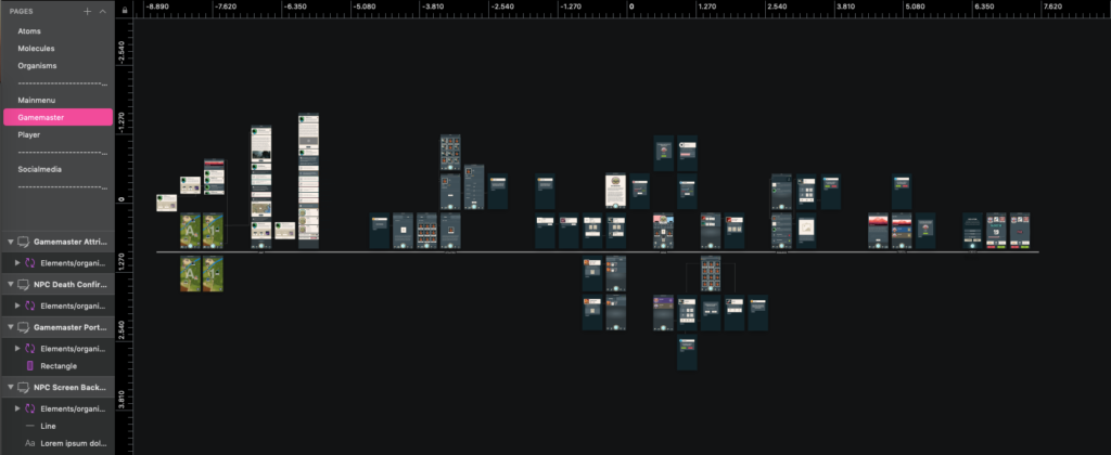
One advantage of Sketch is that we are able to structure the project into UI-Libraries. This allowed us to edit different areas simultaneously and independently from each other. These libraries were linked together at the end. In doing so, we always had the latest state of other areas in mind.
With these resulting screens, we developed the basis for further processes and the design department was able to focus primarily on the content production. We had used these screens to brief programming department which used the basic framework for the visual implementation. The marketing department was able to carry out market research.
We hope we were able to provide an interesting insight into the initial development of Yora Adventures and look forward to welcoming you to the first adventure of Yora very soon.
While you are waiting for the first adventure, tell your friends about it on Facebook, Twitter or Instagram.